19.3.15

Evaluation

In this module we have collaborated well together by utilising our individual strengths. We took an organised approach to the project by using the 'Wunderlist' application, which allowed us to set and delegate tasks with a due date ensuring that the workload was divided equally and that we remained on track from the on set and throughout. We think this organised method we adopted has helped us to create a strong final concept that answers the brief provided.  

The thorough research which we carried out at the beginning of the project is what fuelled our concept. From researching alternative TV packages and technologies to conducting a questionnaire and looking at different users, ensuring we concentrated on both Baby Boomers and Millennials, we have established a real understanding of key behaviours around TV viewing. Our research taught us that casual TV viewing (i.e. unplanned or spontaneous TV viewing) was popular within both targeted groups. This led us to our 'Live TV recommendations' concept which would support and encourage casual TV viewing by recommending shows which were 'on now' based on the users viewing and recording history, creating a new customer experience that would serve both audiences identified in the brief. 

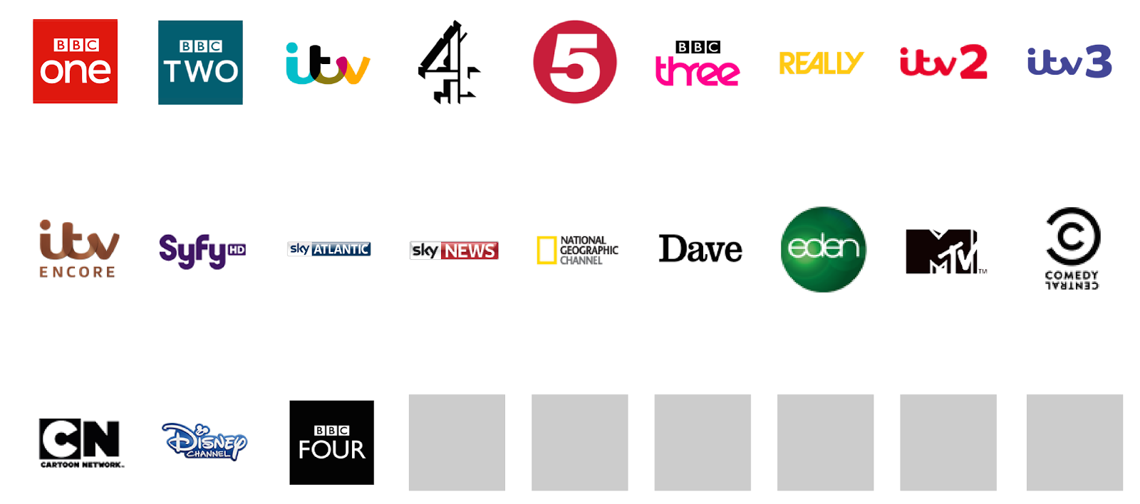
We ensured that our concept was user focused by gaining strong audience insights from our research. The micro profiling element to our concept ensures that the service would be individually personalised to each user, rather then to a whole family. We think this, along side other personalised features including recommendations and popular TV within their demographic, would result in the service gaining popularity and being accepted by both Baby Boomer and Millennial users. Not only do we think that our concept would benefit customers, but we think it would be viable for business. Personalising recommendations would encourage users to watch more of their favourite shows, allowing Sky to learn more about their consumers and therefore increasing customer engagement with the brand. The credit system, that rewards customers with credit with a monthly underspend encourages users to explore the Sky box office more regularly and could lead to the purchase of additional movies and gives customers and incentive to have a more expensive package. Giving channel substitutions allowing customers to exchange channels they don't watch for ones that they do gives an extra level of personalisation to the Sky service and could result in users viewing more regularly by having access to channels they prefer; resulting in a more bespoke service. 

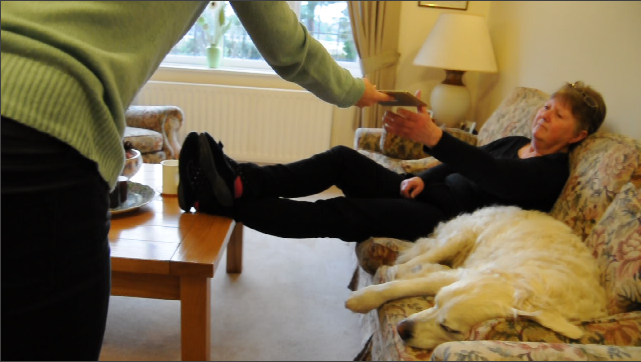
We created a storyboard and filmed a narrative to convey our vision. We based the scenario around a family situation as our research taught us that this demographic is the most likely to have a Sky subscription and would benefit from our concept the most. We aimed to achieve a personalised service which would give users more of the TV they love. We feel that we have achieved this through our concept and established this within our finalised narrative. 

We designed our prototype through trial and error, beginning with simple wireframe sketches and finishing with a clean and simple user friendly interface. We responded well to feedback, ensuring we explored all points suggested for improvement, which has led us to create a visually pleasing application prototype with a strong value for customers.  

Telling The Story Of Our Concept

Please view our final video here

Final Prototypes: Mockups

18.3.15

Final Tweaks

Of course we had to make the voiceover match with the visual elements of the video. We did this by creating and cutting the visuals according to the pace of the voiceover.


We found that despite ensuring that the voiceover was of high quality, the space between sentences of the audio left a slight crackling noise. To solve this, we muted the sound between the voice clips, which created a much better finish.


To finish the video, we added a "happy" music track in the background, which really brought everything together. To ensure that it was not overpowering, we lowered the sound level of the music track to half that of the audio clips - this meant that the music was not the focus of the sound but just added an extra element to it.

17.3.15

Final Prototypes: Interfaces


The log in page displays each family members profile and personalised colour scheme. The user would select their profile and log in using a 4 digit passcode or the fingerprint scanner if they have this feature. Profiles can easily be added by selecting "add profile". We chose not to use upper case letters within our design, as you will see through out the interface screens. We based this decision on the aesthetics on the existing sky brand, and feel that it makes for a more balanced layout. 


This is the main user or bill payers home page. This user will have access to all pages on their My Sky account so they can view their bills, package and orders in one convenient location. In response to our feedback we added descriptions of each page for user convenience as well as adding detail to the icons, which we agree makes the design more aesthetically pleasing. Though we did experiment with adding complimentary colours to the design we felt that it over complicated the interface. We did however, give each individual user their own colour scheme, doing this not only injected some colour into the interface, but also further personalised the experience for the user. To log out of their account users would simply select the 'Off' button on the top right hand corner of the screen. 


This is the 'My Hub' page which includes the users name, photograph and hours of free recording time. We chose to put all family members free recording space on each page mainly for aesthetic reasons. However, we also thought it would be useful to implement a recording space 'donation' system whereby users could give recording space to other users who may require extra. We chose to show this data both in graph format and visually, which also helps to add some colour into the design.

At the top of this page is the users personalised live recommendations which are displayed in a carousel format. In theory when a user selected "watch now" the show would automatically play on their television set so that the iPad takes the place of the TV remote. At the bottom of the screen their is "recommended viewing" this would display general recommendations, which would become more personalised over time as the system learns more about the individual users viewing habits. Users could opt to record or set a reminder and this information would link directly to their TV's, so again the iPad would take the place of the remote.

Another feature we included was the "popular now" segment which would display top ranking recommendations from within the users demographic, thus making the Sky experience even more personalised. Other features include buttons to take users to their recordings/ reminders, as well as an option to view the TV guide. This was something we initially missed out of our design, which we have rectified thanks to our user testing. We realised without an option to see the guide, users could not view what was on in order to make recordings or set reminders.


When the 'TV Guide' is selected users can view whats on TV now as well as being able to scroll along to see what else is on that day. 


When a programme is selected an overlay appears displaying the time the show is on and a brief synopsis of the programme. From here users can choose to set a recording or reminder. When a reminder is set the overlay will disappear and a small alarm clock icon will appear on the top right corner of the box.  When a recording is set a small pay button will display in the same position - this is depicted further down in the post. 


On the 'My Package' page users can view what features they have within their current package as seen on the left hand side. Users can also view their monthly subscription cost, as well as their remaining credit. When setting up their Sky accounts users would set a budget for their Sky service and any remaining funds could be redeemed through box office movies as displayed on the right side of the design.


The four screens above display the 'substitutions' feature that we have included within our concept, which is located within the 'My Package' page. Upon selecting 'Chanel Substitutions' users will see their current channels, the extra channels they could swap in, and their removed channels. In order to add an extra channel users would first have to remove one of their existing channels. This is done by holding down the icon of the channel they wish to remove. This would then change to a blank box and the option to add an extra channel would appear in the form of a small plus sign. Users would then select the channel they wanted to add and its icon would fill the blank box. Not only could this process be fulfilled manually by the user, but as Sky learned about the users viewing habits channel swaps would be made automatically, thus giving users more of the TV they love.


Once again, this is the My Sky home page. This displays how users can personalise their accounts by having an individual colour scheme. This user is not the bill player, and so does not have access to the 'bills & payments', 'my package' or 'my orders' pages, illustrated by the dark background. This would ensure that no unauthorised charges would be made.


The four screens above display the 'My hub' page, 'TV Guide' and the record option, personalised to a different user.

Creating The Video: Visuals

Using a tripod and a high quality SLR camera we filmed several scenarios for our narrative. Filming the area from different angles and aspects allowed us to tell a story in a dynamic visual way. We chose to shoot from wide angles and closeups so that we could cut between the two, allowing the viewer to experience the "real life" situation and envision themselves in the same position.


For the aesthetics of the video, we chose to use the light blue colour we have used throughout our blog and presentations as a plain and simple background. Adding a TV vector at the beginning gave the video an initial context.


While the footage brought the concept to life, we didn't want the video to be too long, and decided that including scenes of a walkthrough of the prototype would help to explain the concept. This allowed us to explain the features in more detail.


Initially, we had no transitions between the scenes and they cut from one to the other. This meant that it wasn't very appealing and looked quite static. To solve this, we made each clip enter/exit by swiping up, almost like a parallax scrolling website. This gave it a bit more excitement and finesse.


To finish the video, we used the Sky logo and slogan. This rounded up the video and reminded the user of the brand. We kept our video simple, using minimal overlaid text, and despite originally thinking of adding vector images over the footage to give further explanation, we felt we didn't need this as the voiceover was descriptive. The video told the story we desired and we were pleased with the outcome.

Creating The Video: Audio

We decided to create a voice over rather then using on screen text, in order to give our video a professional finish. We created the script according to our storyboard, so that the visual and audio elements would work in tandem with each other and used an Olympus voice recorder to get high quality sound. 

This is the script we created:


Introducing My Sky, a personalised viewing experience that gives you more of the TV you love. 

(walkthrough)
My Hub, located within the iPad application, is a new feature of the Sky+ package. My Hub allows each family member to create their own personalised account, offering them tv recommendations and suggestions based on their tv viewing habits. 

(on the iPad)
Heather uses her hub to record her favourite programmes within her own private recording space. This allows my sky to build Heathers profile based on her preferences. Over time, increasingly personalised suggestions will be made, giving Heather the opportunity to explore exciting new content. My Hub also displays trending series that are popular amongst other Sky users within the same demographic.

(clip of handing over iPad)
The micro-profiling concept of My Hub results in each individual user receiving a personalised sky service that allows them to feel more recognised by the brand.

(walkthrough) 
As the bill payer, Mrs. Anderson is the only user to have access to her account details, ensuring that there are no unauthorised changes made to the package. My Sky allows Mrs. Anderson to view her bills, arrange an engineer visit or even seamlessly upgrade her package from one convenient location.

(on the iPad)
As a regular daytime tv viewer, Mrs. Anderson frequently sets reminders in her hub. She uses the live TV recommendations to suggest tv programmes in real-time that my sky knows she will enjoy, improving her casual tv viewing experience. The iPad communicates with the TV, allowing mrs. anderson to use it in replace of the remote.
(clip of tv homes under the hammer)

(walkthrough) 
When signing up for My Sky, the Anderson's were asked to set a budget for their sky service. Over time, their package can be made progressively bespoke with channel substations. Utilising the data from their viewing habits can result in channel swaps being made by my sky, giving the Anderson’s access to extra channels in place of ones that are not used. This can also be done manually by the user.

(on the iPad)
Underspending on their package results in credit which can be redeemed by viewing movies in the sky box office. Heather and her mum can enjoy a film together and feel appreciated by the sky brand, receiving a valuable service that gives them an optimum TV viewing experience.
(clip of tv film)

Sky: Believe in better.


16.3.15

Prototype Elements

To create scrolling elements and all other visual elements of the prototype design we created these in Adobe Illustrator. This meant that we were able to create the imagery at the correct dimensions for the interface and create good quality images without compromising the speed of the proto.io software.